Moving Your Lab to a DTC Model: User-Friendly Reports
Could your lab end up needing a forward-facing employee who deals directly with patients? I say it’s likely; here’s why. What we’ve seen with COVID testing is a sudden emphasis on patient-directed orders. Patients are going directly to a testing facility, bypassing their physician. Here at U.S. HealthTek, we’ve seen a significant uptick in labs asking for patient-friendly portals. We’ve gotten involved as middlemen in a way, being proxy testing brokers. This has opened up possibilities and begs the question: Will this trend carry through with other types of testing? And if our customer base is fundamentally changing, what does that mean for our way of doing business?
This may be the driving force for us as an industry to address an issue I’ve been thinking about for a decade: Making lab reports more accessible to all – including “end users.” Coincidently, I recently ran across an article in WIRED I had saved from years ago that asked the question that so many of us have asked: Why are lab reports so hard to read? Lab reports are sometimes difficult to understand even for those working in medical offices, so maybe now is the time for a serious redesign. From the article:
The typical blood test report is an exercise in obfuscation, a document that needs to be translated by a lab technician or physician, and that’s if you somehow manage to see a copy of your results. In many US states, it’s illegal for a laboratory to send test results directly to a patient—a regulatory puzzle that leads some labs to simply deny direct results to any customer, anywhere. The blood may be yours—but the information it contains is not.
[Note: It is no longer illegal anywhere. In 2014 the U.S. Department of Health and Human Services took action to provide patients direct access to the patient’s completed lab tests reports in order “to empower patients to be informed partners with their health care providers.” Labs can and have been fined for not doing so (see page 8 of the December 2020 issue of the G2 Intelligence report). Yet the vast majority of patients don’t think to ask. Now that they are used to patient-direct lab experiences, I think they will.]
Color and Diagrams
As just one example, I see patients who want information about their cholesterol (such as their Complete Blood Count, etc.) being more comfortable going directly to a lab. And those tests ordered from a doctor’s visit? The patient will be more willing and motivated to take them home and read them – and understand them – without a doctor’s interpretation. Imagine a scenario where after the doctor’s visit, the doctor sends the patient to the lab, and then the lab sends the results directly to the patient. This could eliminate the need for a follow-up visit.
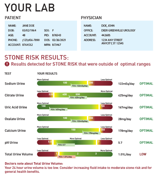
The article in WIRED showed examples from a couple of the big labs, and they had some simple, excellent ideas. These included using color, and adopting a familiar green-yellow-red palette to make it easier to identify what needs immediate attention. And those numbers that fill these reports usually have no context. Having reports that contain qualitative interpretations of the data, showing how low or high something is, would be easy enough to do. WIRED goes on to advocate keeping it simple with a single page overview, keeping it relevant with clear call-to-actions, and by including charts.
Over the years I’ve used these ideas and some of my own mock-ups to show how lab reports could be designed. I brought in some physicians to look at them to say what they liked and didn’t like. This was years ago, and it was really still a taboo subject in the sense that many physicians were weary of the whole idea. Understandably, they had concerns about patients correctly reading a lab report and managing their own health without physician assistance. I completely respect that, but I do think overall the trend for patients to go directly to labs for matter is inevitable and the onus is on us to find a way to present the data in a consumer-friendly format.

Maybe the reports with a series of gauges – like odometers, fuel and temperature gauges like a car dashboard. Or even a simpler approach like our example here. The use of color is powerful, and at a glance, with no explanation, a patient can understand it. Graphics like that are so much more meaningful than a number.
There are increasing examples of this approach being used by labs, though it could be taken further and be a more accepted practice. More than ever before, rethinking how information is reported, and formatting it so that they are so clear that little-to-no explanation is needed, is going to be something that patients come to expect. Labs that get ahead of this curve will have a clear advantage.


